
Why A Classy Home Is Best Designed Through Moderation
- Aug 22, 2023
- 2 min read
When we think of class, especially as related to home design, it’s easy to think of overwrought stately mansions or luxury homes that seem to display wealth at every turn. Sure, these can look wonderful, with fixtures that take your breath away, like central lobby chandeliers that reflect and refract light around the room.
But the truth is that class isn’t always the same thing as displayed wealth. In fact, having a great deal of wealth only opens you up to making worse decisions, because now everything is at your disposal. Everyone can see when something feels tacky, over-ornate, or too much for the space it’s in. When someone is vastly overdressed, for example, it’s hard not to notice it.
So, when hoping to add a touch of class to your home, sometimes moderation is the healthiest first step to take. When you design within limited parameters, suddenly your creativity becomes so much more intensified. In that headspace, you may find some value in the following advice:
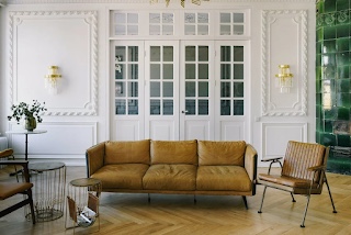
Singular Ornate Fixtures
Singular ornate fixtures can add more than you think. When we think of class, we often think of effortless grace and confidence. So for example, someone dressed in a beautiful evening gown with one bold accessory looks more composed than someone wearing the same gown but with ten other items on top. Knowing when to stop will have more of an effect than anything else: as the old saying goes, less is more. So, you might decide on some ornate or luxury furnishings such as marble dining table and chair sets, while keeping the rest of your room simple and matching. This way, your mainline feature speaks for itself.
Avoiding Clutter
Avoiding clutter or decluttering can be a worthwhile measure of helping your home seem composed and purposefully designed. It may be tempting to add a photograph of every single family member on the wall, but it could be nice to moderate them through your halls, perhaps even backlit with beautiful frames. Make each piece on a shelf stand out as opposed to overstuffing it, allowing for more functional space you can use at any time. Sometimes, the less you add, the more you give.
Visual Harmony
It’s also good to think of visual presence and how it can affect the state of your home’s aesthetic. For example, clashing colors or mismatching textures and patterns can cause the brain to work overtime. In Michelin Star restaurants, the master chefs attempt to make each plate understandable by letting the flavors speak. Use this approach to design your home as well. Neutral colors with subtle feature walls, palette shading and more can look fantastic around the home, as can theming certain textures like wood pattern or dark oak in bedroom spaces. Visual harmony helps the room stand confidently, as opposed to feeling disparate.
With this advice, you’re sure to see how a classy home is best designed through capable moderation. It may take some time to get right, but you’ll be sure to thrive with that mindset in place.


Comments